Web Typography: A brief guide to type on the web
This is a presentation I did for the Cambridge WordPress meetup. It is quite an indepth look at typography on the web.
I hope it is useful for developers and designers alike
Technical considerations
Native fonts Vs self-hosted fonts Vs Remote hosted fonts
Native fonts
Native fonts live on the user’s system. Since they are already on the user’s computer they will display instantly. Be careful though, as fonts available on one system may not be available on another. For example the font “Helvetica” is available on OSX (Macs), but not Windows (PCs).
Systems default to one of five generic categories
- serif
- sans-serif
- monospace
- cursive
- fantasy
You can check which fonts are available on each operating system at: http://www.cssfontstack.com/
Self hosted fonts
These are fonts that we install on our server and the user’s browser downloads when they visit the page. We generally call them using the @font-face code in our css
Fonts come in a variety of formats:
- woff2 – Cutting-edge Web Open Font Format
- woff – Web Open Font Format
- ttf – True Type Font
- eot – Embedded OpenType, used on Windows
- svg – Scalable Vector Graphic
We mostly want to use woff2 and woff, but may need to provide ttf, eot and svg as fallbacks for very old browsers
Examples of use:
@font-face {
font-family: 'MyWebFont';
src: url('myfont.woff2') format('woff2'),
url('myfont.woff') format('woff');
}
body {
font-family: 'MyWebFont', Fallback, sans-serif;
}
Self hosted fonts – Pros and cons
- Self hosted gives you more control over the fonts you use
- More reliable delivery, since you are relying on your server and not someone elses
- Get to chose from all the web fonts available in the world
- Expensive
- Calls for a commitment
- Fiddly to setup and get working – requires downloading files, uploading them to your server
Remotely hosted fonts
An alternative to buying fonts and installing them on your system is to use a remote service. Options include:
- Google Fonts
- Adobe TypekitInstead of calling the font files from your own server these are called from a separate service.
Examples of use:
Add to head of your document
<link href='https://fonts.googleapis.com/css?family=Open+Sans' rel='stylesheet' type='text/css'>
And call it in your CSS thus:
font-family: 'Open Sans', sans-serif;
Remotely hosted fonts – Pros and cons
- Less control over the fonts
- Relying on another server – font stack even more important
- More limited choices
- Can be free. Subscription services cost money – but gives you the chance to play with fonts more
- …therefore no commitment
- Quick to set up
Font stacking
Because all systems have default fonts for all these categories we should specify them as backup fonts in our “font stack”.
A font stack specifies a list of fonts to use with each subsequent font being a fall back if the previous font was not found
For example:
font-family: 'Helvetica Neue', Helvetica, Arial, sans-serif;
Is an example of a font stack for Helvetica Neue. This typeface in available on modern Macs but may not be available for older ones. If the typeface isn’t found we default to Helvetica, then Arial (the Windows equivalent of Helvetica) and finally sans-serif. Check http://www.cssfontstack.com/ for example font stacks.
This is important because when we use our own fonts we still need a font-stack so that the user still gets a useable typeface if ours fails to be delivered for whatever reason.
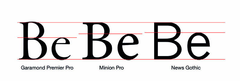
Anatomy of type
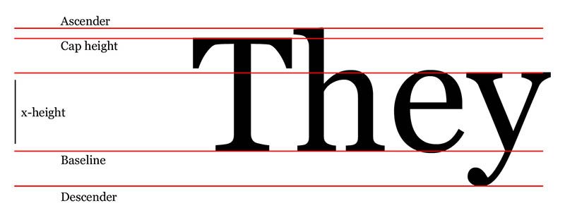
Baseline: The line the type sits on, note that descenders dip below this line. Also for reasons for optical perception the curve of an “e” or “o” also slightly dips below this line. This is because a letter “o” looks odd if it sits exactly on the baseline.
Cap-height: The height of a capital letter. Note that certain ascenders can extend above the cap height
x-height: The distance between the baseline and the top of a lower case “x”. This is important because the relationship between a letter’s x-height and the cap-height affects how readable a type is.
Types of font
Serif versus sans-serif and other categories:
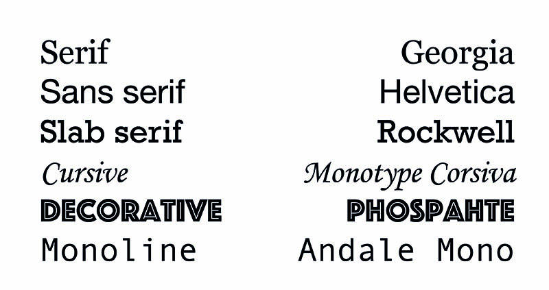
There are many different font styles but an obvious place to start is between serif and sans-serif fonts.
Serif fonts have extra features such as brackets and finials on the end of strokes. Before the Victorian age almost all typefaces were serifs.
Sans-serifs first emerged in the Victorian age primarily as a advertising form. However they really came to prominence in the 20th century during the modernist period.
Both forms have their uses and although sans-serifs are being used more and more, serifs still have a big role to play, especially for long form reading, as I shall discuss below.
Context
Type for the moment
Type for long-form reading
Longform type
- Eccentricities amplified when repeated e.g. Bree Vs Calluna
- Good x-height: 60-70% of cap height
- Low to medium contrast
- Distinct letterforms
- Full punctuation / extended language as required
Eccentricity examples
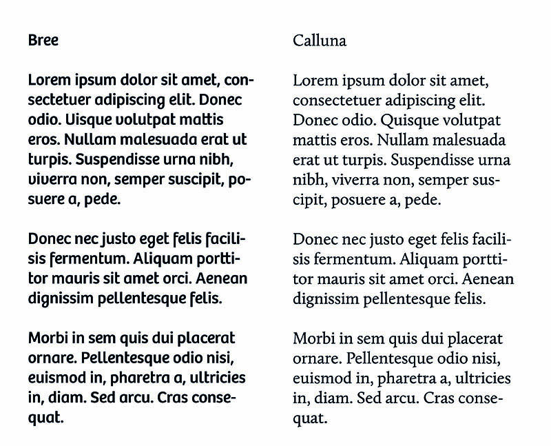
In this example you can see Bree may appear to be a nice typeface. But the eccentric “g” and “f” would quickly becoming irritating over the course of reading a long document. Calluna, on the other hand, still has nice features, but would be comfortable for longer reading.
x-height examples
A generous x-height (meaning a smaller difference between x-height and cap-height generally improves readability. But things can go too far. Consider the McDonald’s typeface (this one from the 90s:
The extremely big x-height works as part of display advertising, but won’t be suitable for long form reading because scanning a line of text is difficult when the letterforms are a near uniform height.
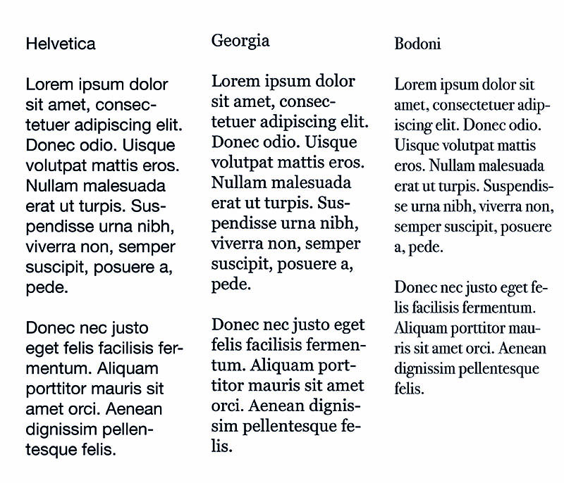
Low to medium contrast

Contrast reflects the degree of difference between the thin and thick strokes of a typeface. Sans serif fonts like Helvetica tend to be quite uniform, meaning there is no or little difference in stroke thickness.
Serif fonts tend to have more contrast, and some, such as Bodoni, have extreme contrast.
It has become a trend to think that uniform sans-serifs are somehow more “professional” and “modern” than serif typefaces. But there is a reason why novels and newsprint tends to be set in serif. By having contrast and serif features like brackets these typefaces have enough differentiation between letterforms to aid the reader and make the experience smoother.
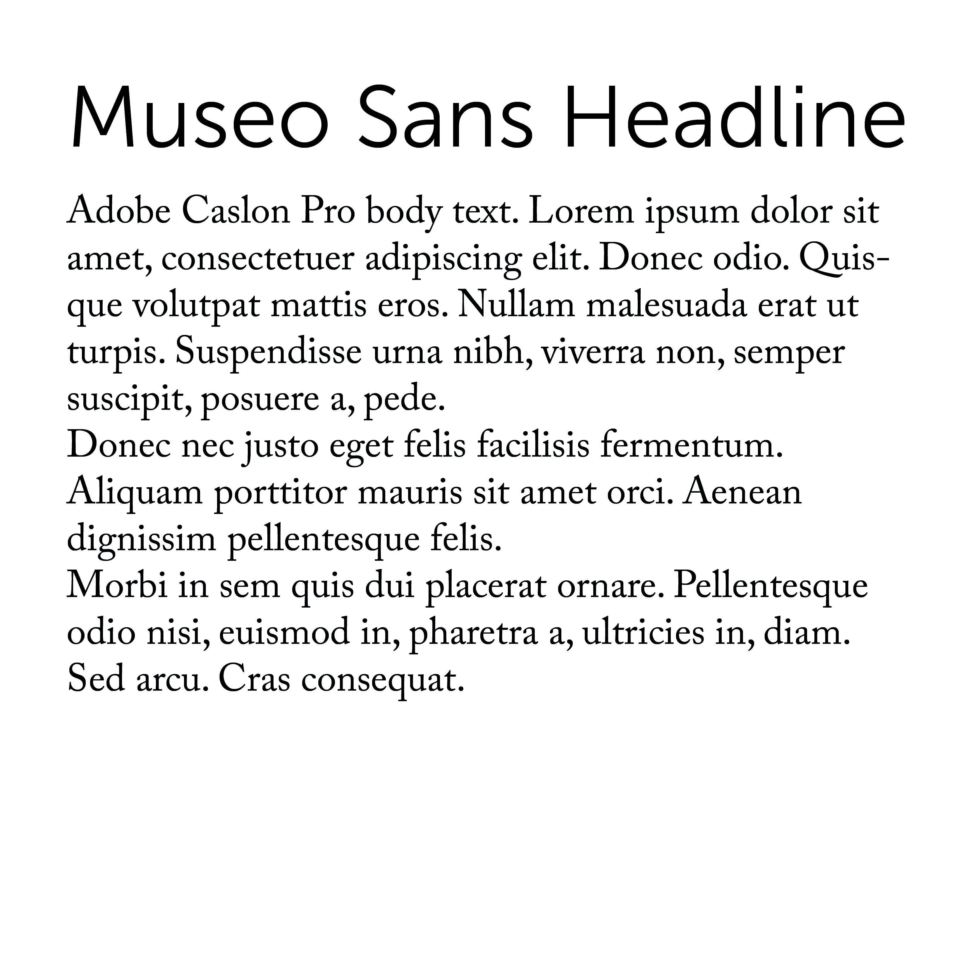
It is therefore a good idea to user sans-serif typefaces for titles and display purposes and serif typefaces for the long form text:
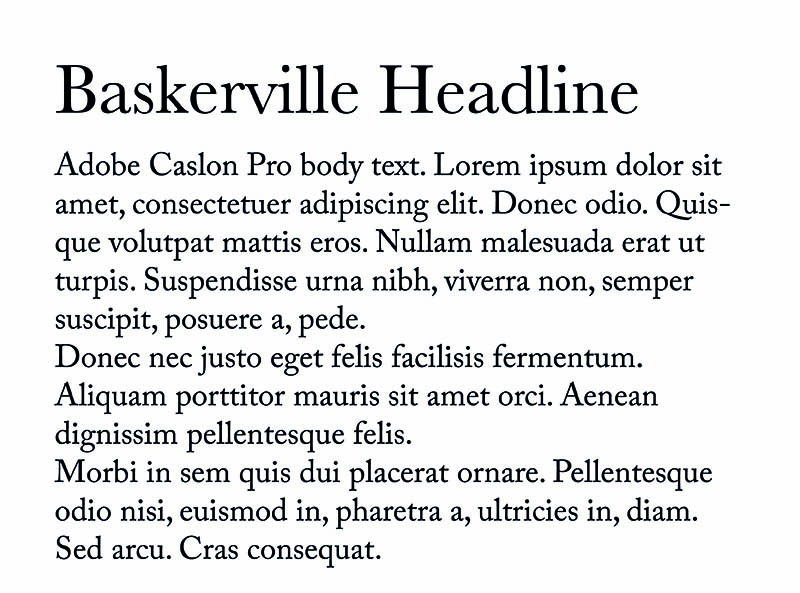
Pairing fonts
Contrast Vs Harmony
Consider pairing serifs with sans-serifs to create contrast
You might consider using just one typeface and using scale, colour or weight to indicate hierarchy
If you do choose to pair fonts there are some considerations:
You want enough contrast to indicate a deliberate difference between typefaces
Pairing two serifs with each other is difficult because the different serif styles tend to clash
Therefore it’s common practice to pair serif body text with sans-serif headlines or vice-versa.
Here are some examples:

Establishing hierarchy
The most obvious way to indicate heading and subheading priority is through scale
Simply put, the larger the font the more important it is
But there are other ways to establish hierarchy:
Weight
colour
Style
A note on sizing fonts:
You can style fonts with by simply specifying the size in pixels
BUT: You can also size fonts using ems and rems
An Em is a relative sizing method. by default 1em is set by the browser to 16px.
You can then use this to set other typographic elements relative to an em.
So we could set our p element to 1.2em then our h1 element to 2em
The advantage of doing this is that if we ever want to change the size of our p element font the other elements will scale appropriately
This is particularly useful because not all typefaces are the same size. Also we may want to tinker with the text size on different displays
Setting type
Typographic Scale
There are two schools of thought about how to size typographic elements in relation to one another
The first school is to do everything by eye. So for example using 16px as a base double the size for a sub head and double again for a headline size and adjust it until it looks right.
The other school suggests using a typographic scale to provide a mathematical base for the scaling of type.
You can find examples of these at: type-scale.com
Measure and line height
An old rule from print typography is that the measure (line length) should be between 45 and 75 characters, so adjust your text boxes to accommodate this length. Ideally aim for something in the mid 60s.
The line height is the distance between lines of text. There is no magic number as to what this should be because it depends on the fonts descenders, ascenders and things like the font weight.
Generally the longer the line length the more line height you need to make it more comfortable for the eye to move between lines of text.
Neglecting measure is super common on websites, but it’s easy to fix.
Justification
In products like Adobe InDesign there are a host of options to handle hyphenation which don’t exist in css.
Because of this is often best to avoid hyphenating text on the web.
Therefore, unless we have a generous measure a left justified / ragged right setting is usually best.
This avoids rivers in our text.
Responsive design
On a desktop people are usually reading text from about an arm’s length away.
On a phone or tablet, however we generally read from a closer position.
Therefore we can reduce the font size a bit to compensate. This has the added advantage of increasing our measure slightly.
The measure will always bit a bit short on a mobile, but again we can compensate by decreasing the line height a bit.
Further reading
This has been a long post, but it has only scratched the surface of web typography. Here are some useful resources if you want to find out more:
On Web Typography by Jason Santa Maria – A List Apart
Articles on web typography at A List Apart